What is a style guide, and why do I need it?
A style guide is essential for any growing business. The primary purpose of a style guide is to provide clear marketing guidelines and make branding and communication easier, both internally within your team members as well as externally to your customers and stakeholders.
A good style guide should clearly explain:
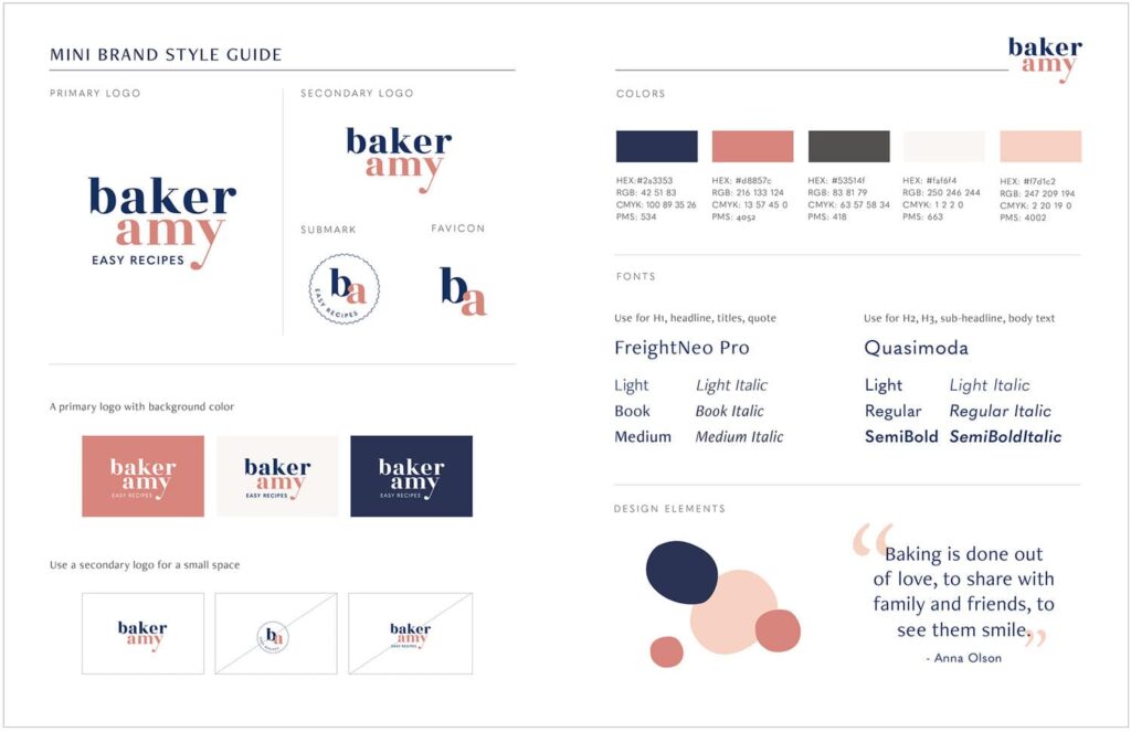
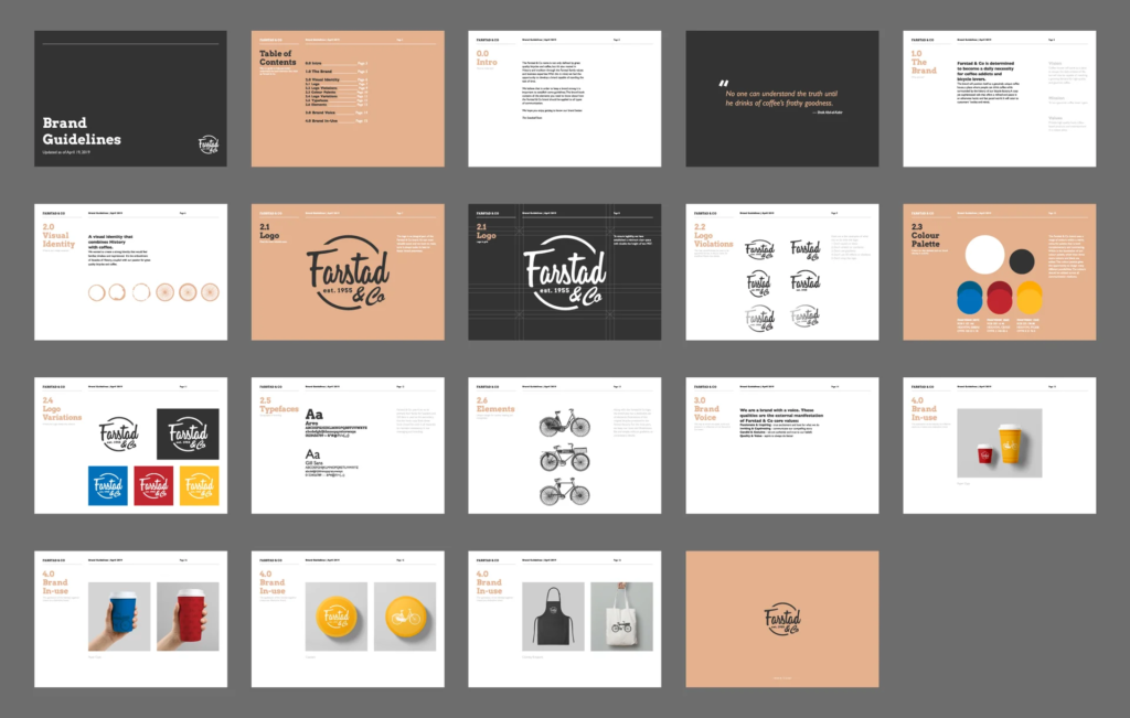
Here are some examples of a company style guide:
In this guide, we will walk you through the process of creating a style guide for your own business/ brand.
Don’t miss the last part, because after introducing you to what elements you need to consider, we are providing a customisable template for you to use right away!
What needs to be included in a style guide?
A. Brand Identity
A style guide should clearly and concisely guide the reader to understand the business’s key value, vision, and brand before creating any content or designs for your company. Here are some things you should include:
“Who we are”: Mission and Vision
Brand Personality
Target Audience and Tone of Voice
It’s similar to a teacher selecting appropriate teaching materials for a specific class. For example, teaching kindergarten children about colours instead of chemicals. Then, how does the teacher teach? Do they use a formal tone? Are they funny? Do they simplify things? Or do they use technical terms?
Keep your brand identity in mind when going through the next sections!
B. Graphic Elements
In this section, add the graphic elements and media your brand should consistently use to showcase your brand. Logos, illustrations, photos of your products, videos, etc. fall into this scope. We suggest you include some guidelines on how to use these graphic elements as well.
Logos
Logos are the face of a brand and might come in many different formats.
You should consider creating different versions of your logo:
Example of logo in different formats from Spotify:
Logos – Do’s and Don’ts
Explain how to use the logo correctly to ensure that your logo is recognizable to your audience. Think of what you should and should not do when using your logo.
These are some things you can consider:
Example of Do’s and Don’ts from Linkedin:
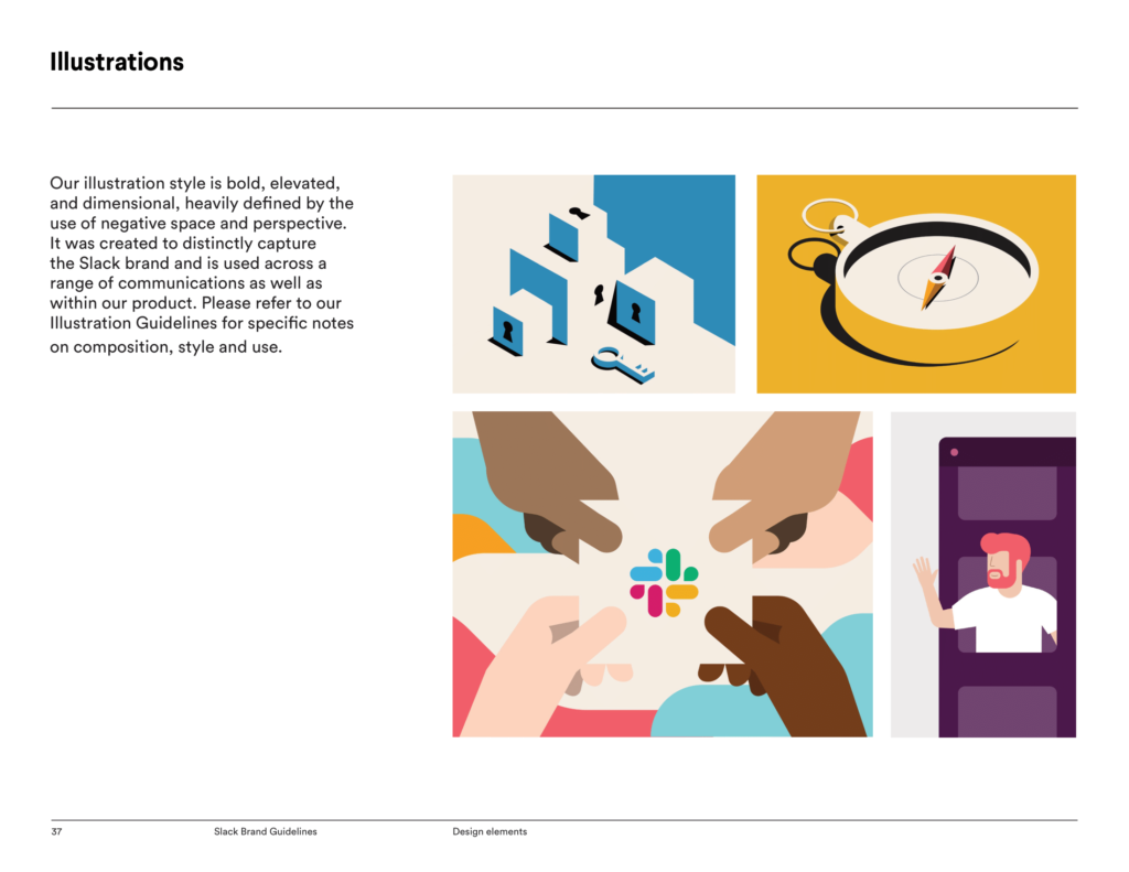
Imagery
For your social media or website marketing and branding, we suggest you use consistent style and designs of imagery, illustration, and other media to represent your brand. In the style guide, note a collection of vector arts, photos, illustrations, and other graphics to be used.
Consider the below:
Example of Photos/ Video guidelines from Slack:
C. Colour Scheme
Think of the colours that would represent your brand and be used repetitively throughout your design for varying purposes.
The main types of colours your should choose are:
1. Main brand colour
The main brand colour is the colour that will consistently appear in all of the branded publications (advertisement, website, printed material, etc.). This colour will be the symbol of your brand.
Below are some guide questions on determining your main colour:
- What is the nature of your business?
Example: Blue is commonly found among financial services as blue symbolises reliability and stability.

- Look into the psychological effects that colours bring.
What kind of emotions or feelings do you want your customer to feel?
Example: Snapchat = Yellow
- Take inspiration from what your key product or service is about.
Example: Netflix = Red and Black, inspired by the colours in real-life cinema and theatres.


2. Secondary Brand Colour
The secondary will also appear frequently in your branded materials, but less than the main brand colour. The secondary colour will also commonly go along with the main brand colour, side by side, as a background, or around the main colour.
You can consider choosing a colour that is either contrasting OR similar to your main brand colour. In the examples below where yellow is the main colour:


3. Shade colour
Shade colours are the lighter or darker versions of your main and secondary brand colours, as you see appropriate. This can be done by adding white/grey/black to your main and/or secondary brand colours.
We suggest you have multiple shade colours to allow flexibility in design and typography.
Example: The image below shows some shades of blue.

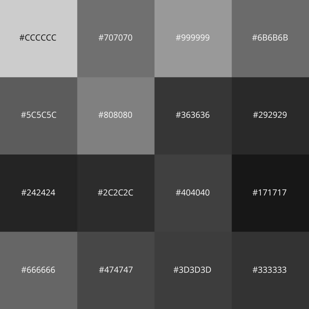
4. Neutral colour
Choose some neutral colours, from white to black, that you want the brand to consistently use for text, extra design, and more. This also prevents your brand from using too many colours, which might blur the brand identity.
Examples of neutral colours:
Tools for getting inspirations for and choosing colours
Colours combination tools:
Tools for obtaining HEX codes, RGB values, and colour names:
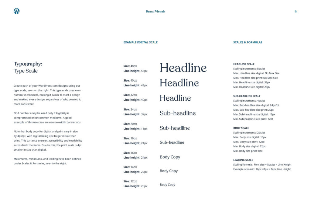
D. Typography
Font
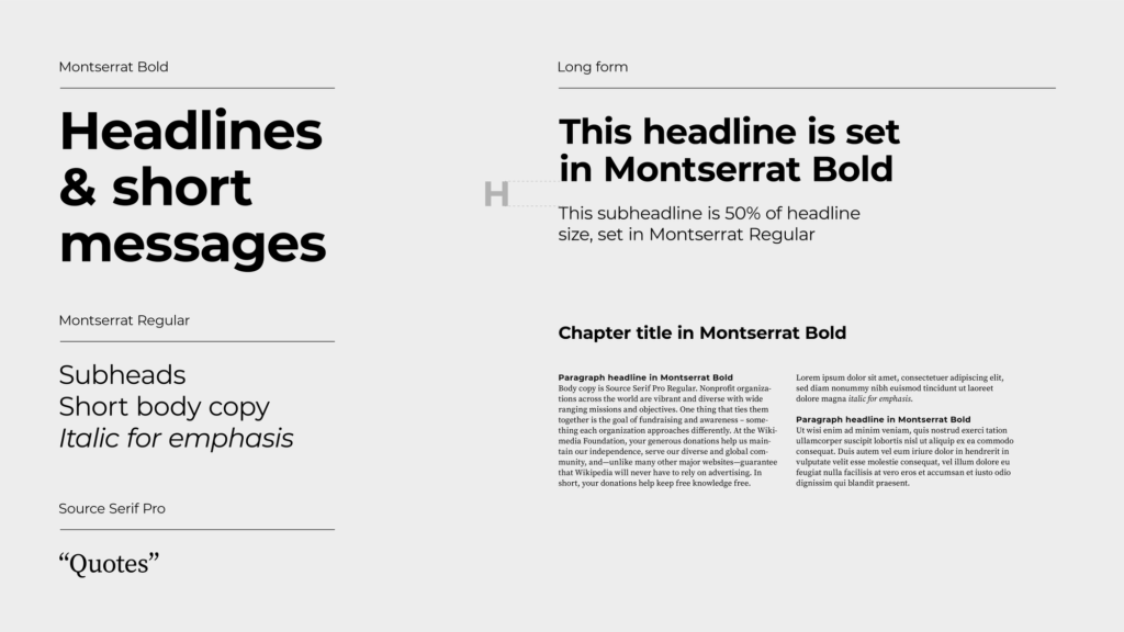
Decide the key font styles your brand will use repeatedly. You should choose an entire family of the font style (bold, italic, different sizes etc.).
When choosing a font style, you should consider:
- Availability: If it is free and accessible in design tools, for your and your team’s convenience):
- Building Emphasis: Build a focus according to where you want your audience’s attention to be by considering the factors below:
Open source font library
Sample usage of Font
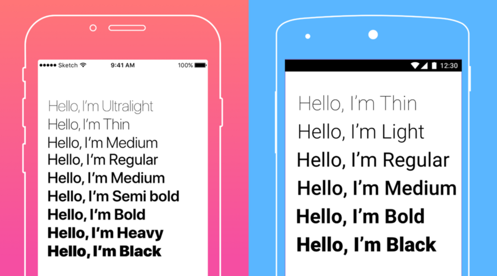
In the style guide, show the examples and sample usages to specify what size and style (e.g. boldness, italics, underlining) should be used in which circumstances for your brand.
The list below is a sample of commonly seen ways of using text:
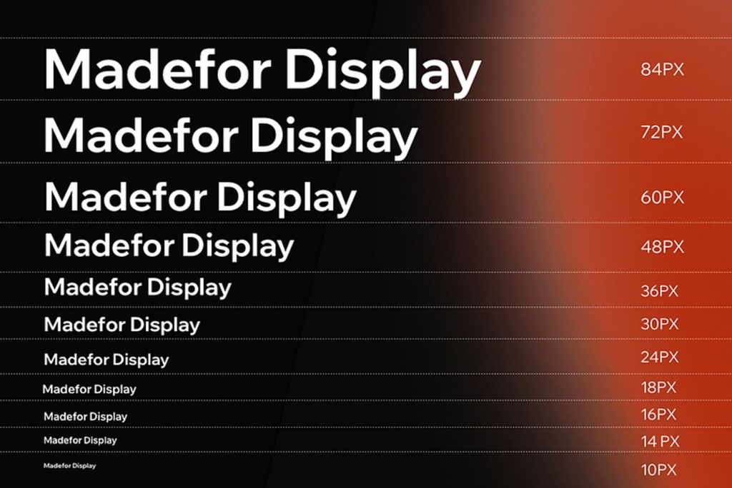
Example: Below are sample images showcasing how you can use text to arrange the content to grab the viewers’ attention and make it easier for them to follow along.
Tools for choosing fonts
Here are some online websites you can use to generate ideas for what type of font you want to use, and you can also see how the combinations of different font styles work.
Font pairing tools:
These are some tools for you to visualize the size of your font and give you a rough idea of how much difference in size you would want your text to be.
Font sizing tools:
This is helpful, especially when designing digital materials such as social media posts, online posters, or downloadable documents.
Additional tip: for printed materials, always print out your project at 100% size, without scaling, to determine if the font size is legible for your printed project.
Use Our Style Guide Template
Great job reading through all the elements you should cover in your brand style guide so far!
To make your job easier, we have prepared a customisable style guide that you can use to start summarising the brand identity, graphic elements, colour scheme, and typography for your brand. Access this template, save as on your own device, and start editing!
Click to access the template (Figma)
Note: We created the template using Figma, a cloud-based tool useful for UI/UX and prototype design. If you do not have a Figma account, sign up first to access the template (it’s free)!